About
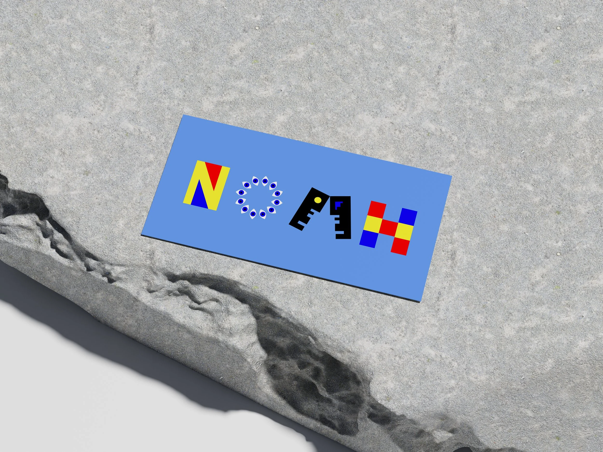
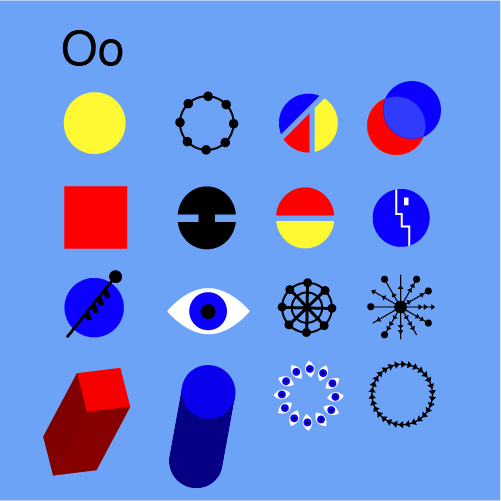
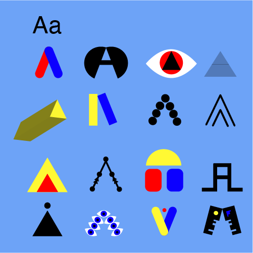
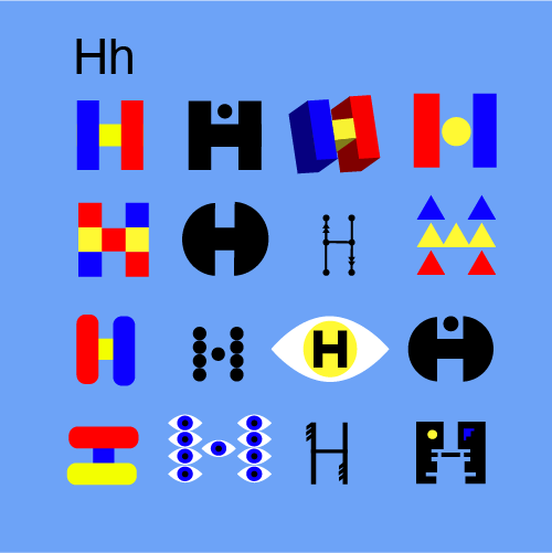
This project, one of my first typographic designs at university, introduced me to the principles of Bauhaus. The goal was to balance functional and creative typography. Inspired by the Bauhaus emphasis on simplicity and geometric precision, I refined the composition and typographic choices to create a more mature and intentional design.
Challenges
Finding the balance between structure and creativity was key to making the design both functional and visually engaging. Reflecting on the piece allowed me to evaluate my original work, identify areas for improvement, and refine the design while staying true to the initial concept.
Solution
I experimented with typography as a visual element by using bold shapes and structured letterforms to create a balanced yet dynamic composition. When revisiting the piece later, I had the opportunity to refine the overall design, adjust typographic choices, and enhance the visual impact—all while remaining true to the original concept.

Key Takeaways
This project was a key learning experience in typography and design refinement. It taught me to apply Bauhaus principles by balancing structure, functionality, and creativity. I learned to see typography as both communication and visual language. Revisiting the work helped me refine the design and understand the importance of iteration in the creative process, deepening my view of design as a journey of continuous growth.