Starke Mädchen
•
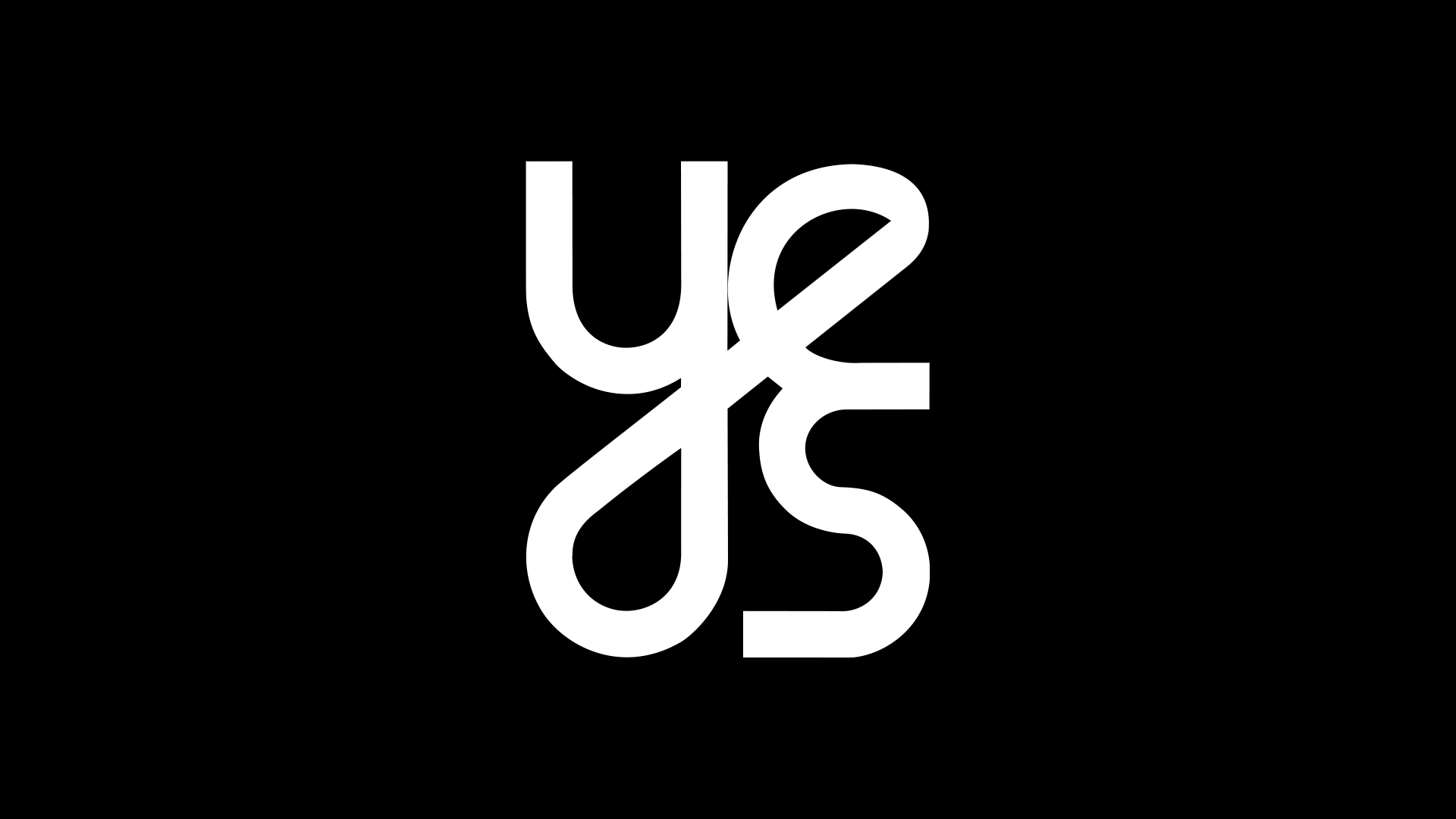
Logo Redesign
•
Starke Mädchen • Logo Redesign •

About
Y.E.S. Starke Mädchen, a Zurich-based nonprofit organization, promoted the empowerment of girls through extracurricular programs. However, as it grew, it became clear that the existing branding excluded boys, teenagers, and female coaches. The goal of the redesign was to create a more inclusive system while preserving the core values. This was achieved by expanding the reach to represent every child and mentor. The revamped visual identity now allows the organization to engage a more diverse audience.
Challenges
The previous brand identity focused exclusively on young girls, which limited the program’s reach and excluded boys, teenagers, and female coaches. There was no clear distinction between age groups, making targeted support difficult. Additionally, the visual identity did not reflect the organization’s inclusivity, leading to inconsistencies across various platforms.
Solution
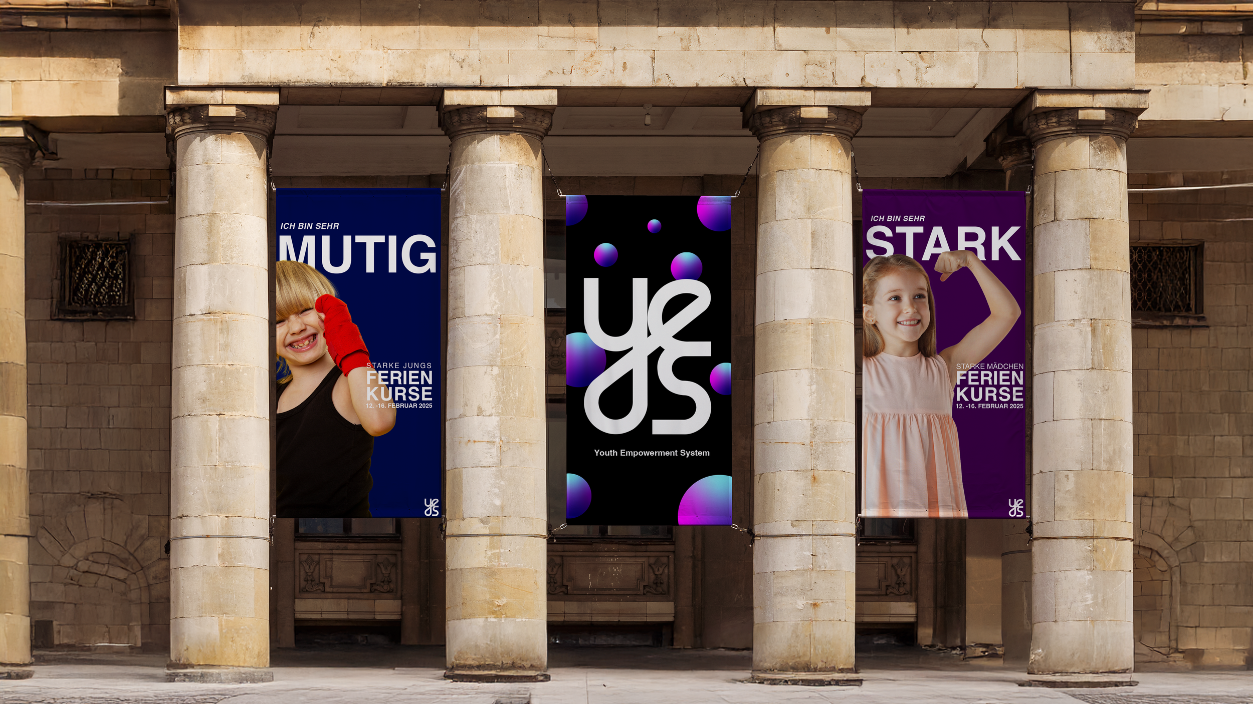
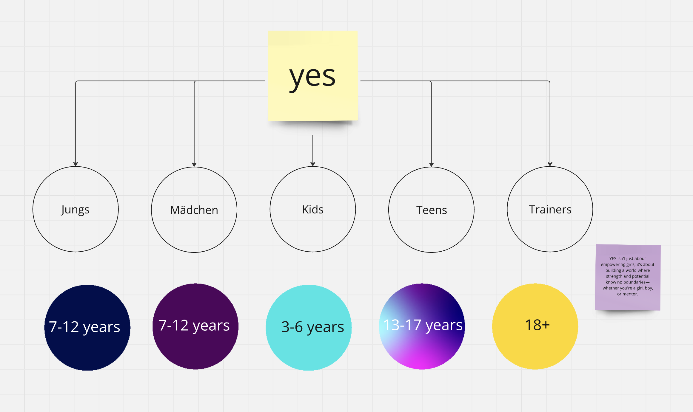
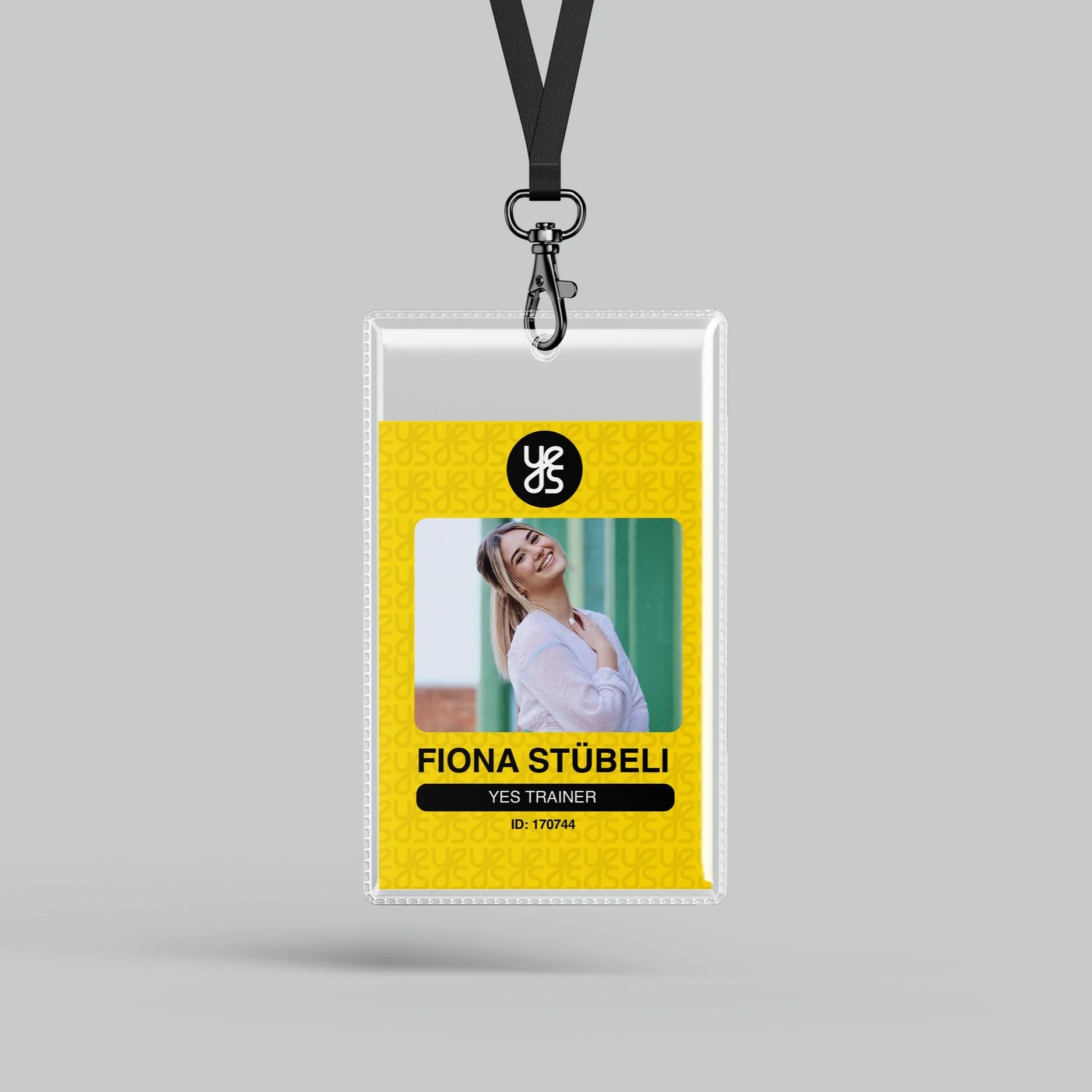
To address these challenges, Y.E.S. Starke Mädchen implemented a refined brand structure that includes sections for children, teenagers, boys, and coaches to provide targeted support. A modernized logo and visual identity were developed to reflect the organization’s inclusive mission, unify all subcategories, and ensure consistency across digital and print platforms.
Exploration Phase


Before
After

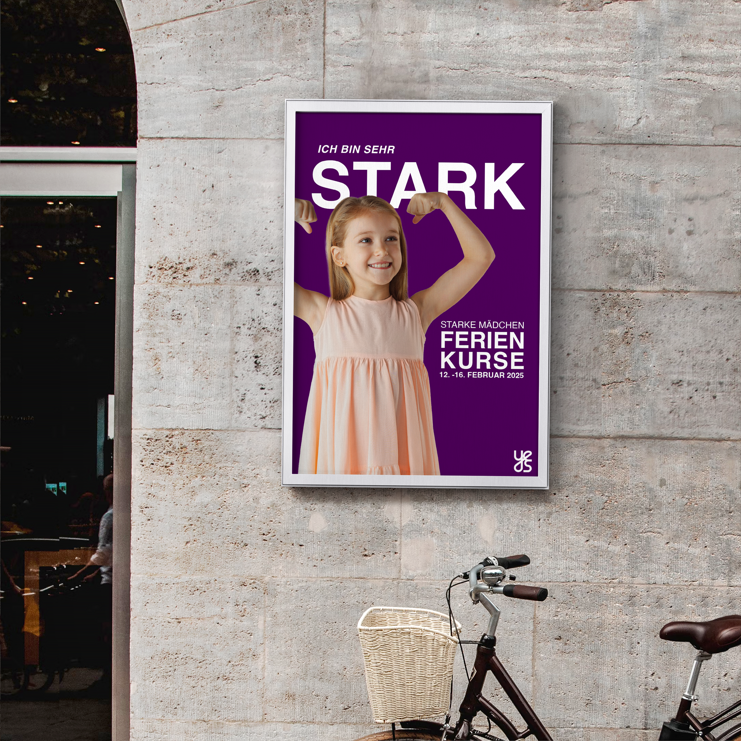
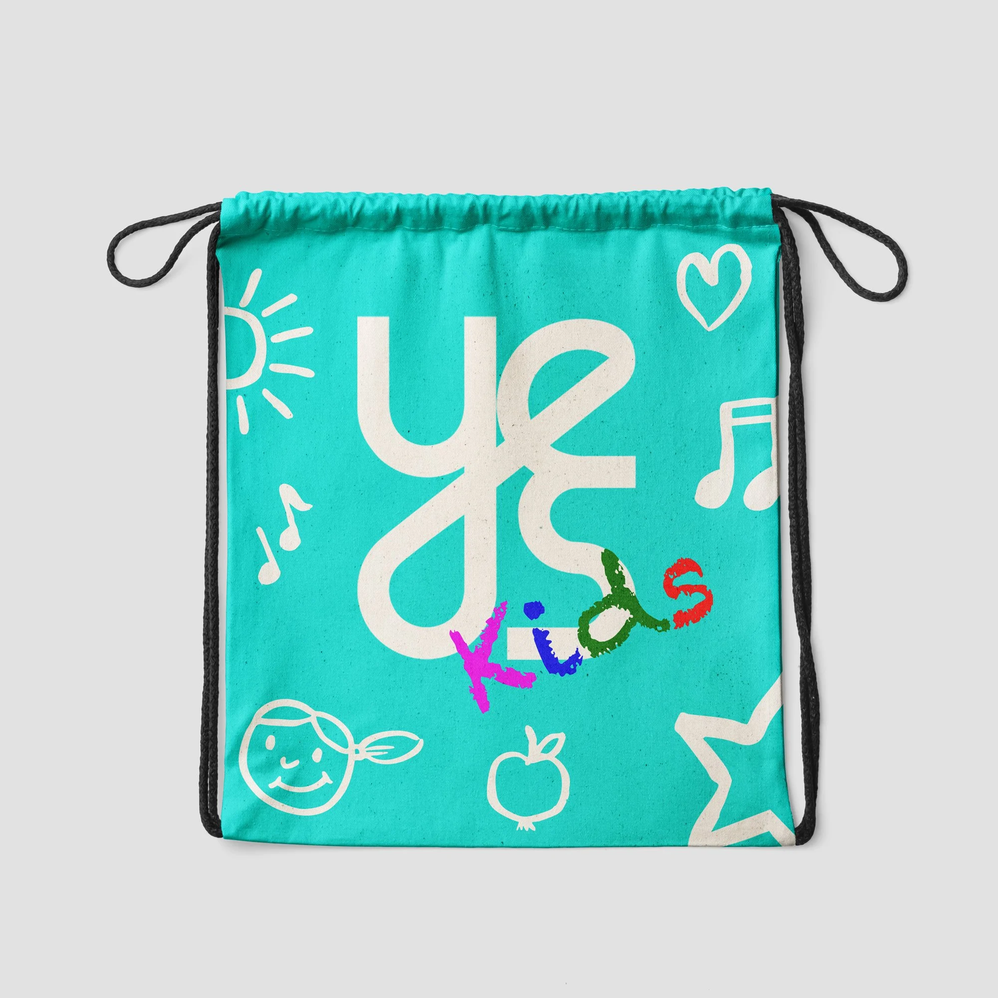
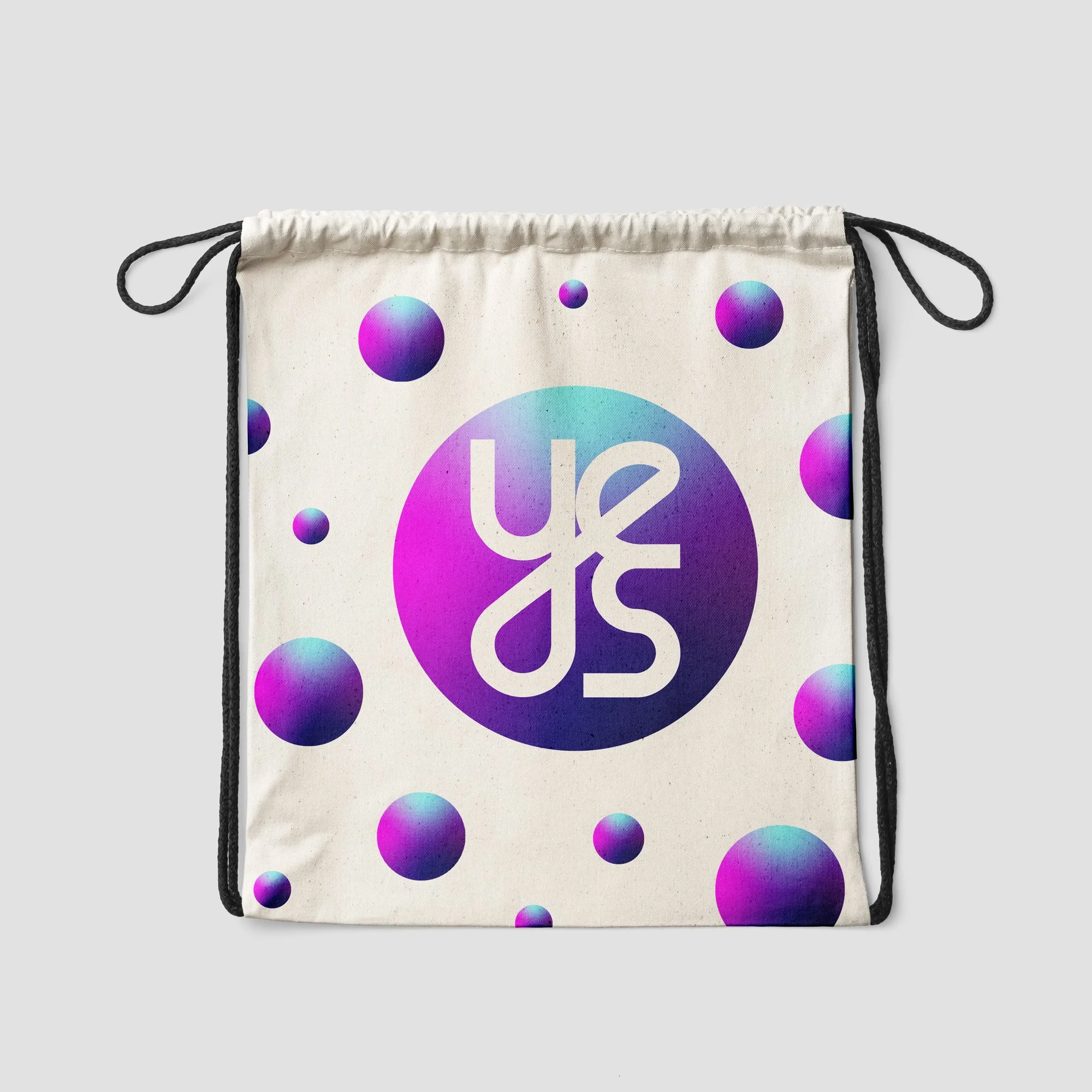
MOCKUPS


Key Takeaways
The redesign taught me the importance of a versatile, inclusive logo that appeals to boys, teenagers, and coaches alike. The old logo was too childish and limited the brand’s reach. By creating a more adaptable logo, I established a unified identity for different target groups. Testing the logo across various physical applications highlighted the need for consistency and visual impact. Ultimately, I learned that a successful redesign involves crafting a logo that speaks specifically to its audience while maintaining clarity in all contexts.